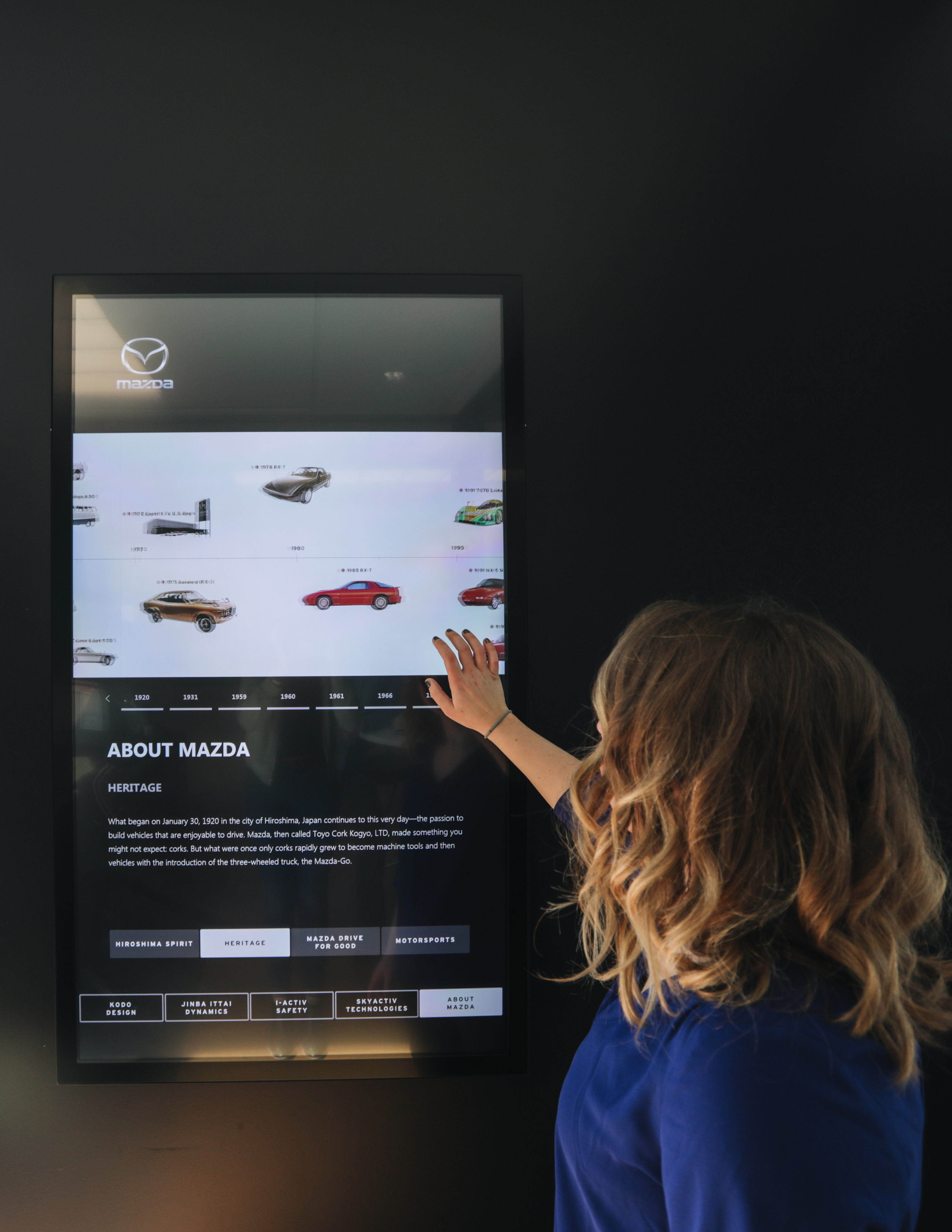
The interactive screen at the center of Mazda's Retail Evolution
Mazda North America was looking for a way to elevate the customer journey within their dealerships. In addition to a revamped showroom, they sought an interactive experience that would give their customers insight into the brand, as well as the confidence to purchase a Mazda vehicle.
The goal wasn't decoration. MNAO saw interactive screens as a key component to a "Retail Evolution" occurring at new and redesigned dealer showrooms, with the explicit aim of using the technology to enhance the dealership experience, elevate the brand, and assist in the sales process with measurable ROI. The screens were also designed to complement existing video wall installations already in showrooms.
Building the full picture
I worked with the client to obtain and analyze a customer journey map that outlined the car-buying experience, then layered in competitive analysis, brand standards review, mood boards, stakeholder interviews, observational research, and a UX Studio. The personas that came out of this work, and the user challenges identified, were key in creating the mindmap and wireframes that drove the design.
Customer Journey Map
Analyzed the full car-buying experience from first awareness through post-purchase to understand where the dealership touchpoint fits, and what customers are feeling and thinking when they walk through the door.
Competitive Analysis & Brand Standards Review
Assessed how competitors were using in-store digital experiences, and reviewed Mazda's brand standards to ensure the final design would feel like a natural extension of the brand rather than a third-party add-on.
Stakeholder Interviews
Interviewed corporate leadership, dealership managers, sales representatives, and customers. Each group had a different view of what the screen needed to do and when it would actually be used in a real sales interaction.
Observational Research
Observed real customer experiences in the dealership environment to understand the flow of an actual visit, where gaps existed, and what moments the interactive screen could meaningfully fill.
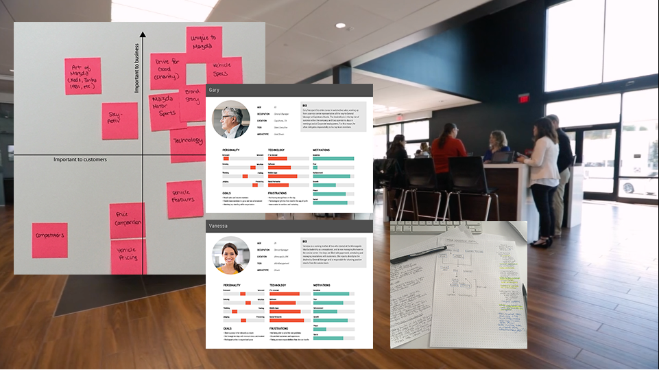
The stakeholder interviews and observational research surfaced several specific insights that shaped the design directly. Sales representatives flagged that customers had more patience for a short video comparison than for reading text, which influenced how vehicle features were presented. The test drive came up consistently as the single most impactful step in the purchase decision, which meant the screen needed to support what happened before and after that moment, not replace it.
Observational research revealed that customers were routinely left alone for 10 to 15 minutes while their rep worked on pricing and financing with the dealer. That waiting time felt tense. It was also an opportunity: the screen could fill that window with content that reinforced the customer's decision and kept them engaged with the brand while they waited.
Video beats text for features
Customers had more patience for a short video comparison than for reading feature text. The interactive experience was designed around this, using animated demonstrations over static copy wherever possible.
The 10-15 minute gap
Customers were consistently left alone while reps worked on pricing. That window felt tense and was underused. The screen had a clear role to play in that moment: reinforce the decision, keep the customer engaged with the brand.
Comparison tools weren't working
The existing website comparison tool wasn't user-friendly and couldn't be shared with customers in a clear way. Reps wanted an in-dealership tool that could live alongside the conversation, not require a URL and directions to navigate.
Half the customers are already Mazda owners
About half of the customers walking into a dealership were existing Mazda owners. The screen needed to serve both the newcomer being introduced to the brand and the loyal customer who already had a relationship with it.
From initial sketches through many iterations
The personas and user challenges identified in research drove the wireframe work. Sketches established the layout concepts before moving into structured wireframes for client review. From there, interactive prototypes were built in InVision and tested actively with stakeholders through multiple rounds.
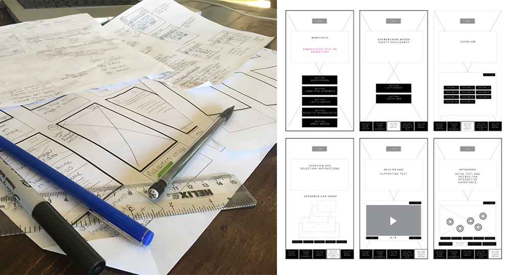
The prototyping phase involved many iterations and active testing. Several real challenges required ongoing problem-solving throughout the process.
Hardware & Orientation Changes
The physical hardware specifications and screen orientation shifted during the project, requiring design decisions to be revisited. Designing for a touchscreen that would live on a showroom floor meant accounting for how customers physically approach and interact with it, not just how it reads on a monitor.
Budgetary Constraints & Evolving Brand
Budgetary constraints shaped what was feasible at each stage of the design. Simultaneously, Mazda's brand was actively evolving, which meant content and visual standards needed to be revisited across iterations to stay current with what MNAO was producing.
A fully-immersive experience built to live on the showroom floor
After several iterations, the final design brought together an interactive brand timeline, animated demonstrations of high-tech vehicle features, and videos that reflect the company's culture. The visual language was developed in close collaboration with Mazda stakeholders to feel like a natural extension of the brand, not an add-on.
"I think the displays are critical to the retail evolution. It helps fulfill all the senses when a customer comes in... It really helps enhance that customer experience... It gives us a tool that allows us to visually demonstrate it to a Mazda customer instead of just telling them about it."
Mazda Dealer, post-implementation interview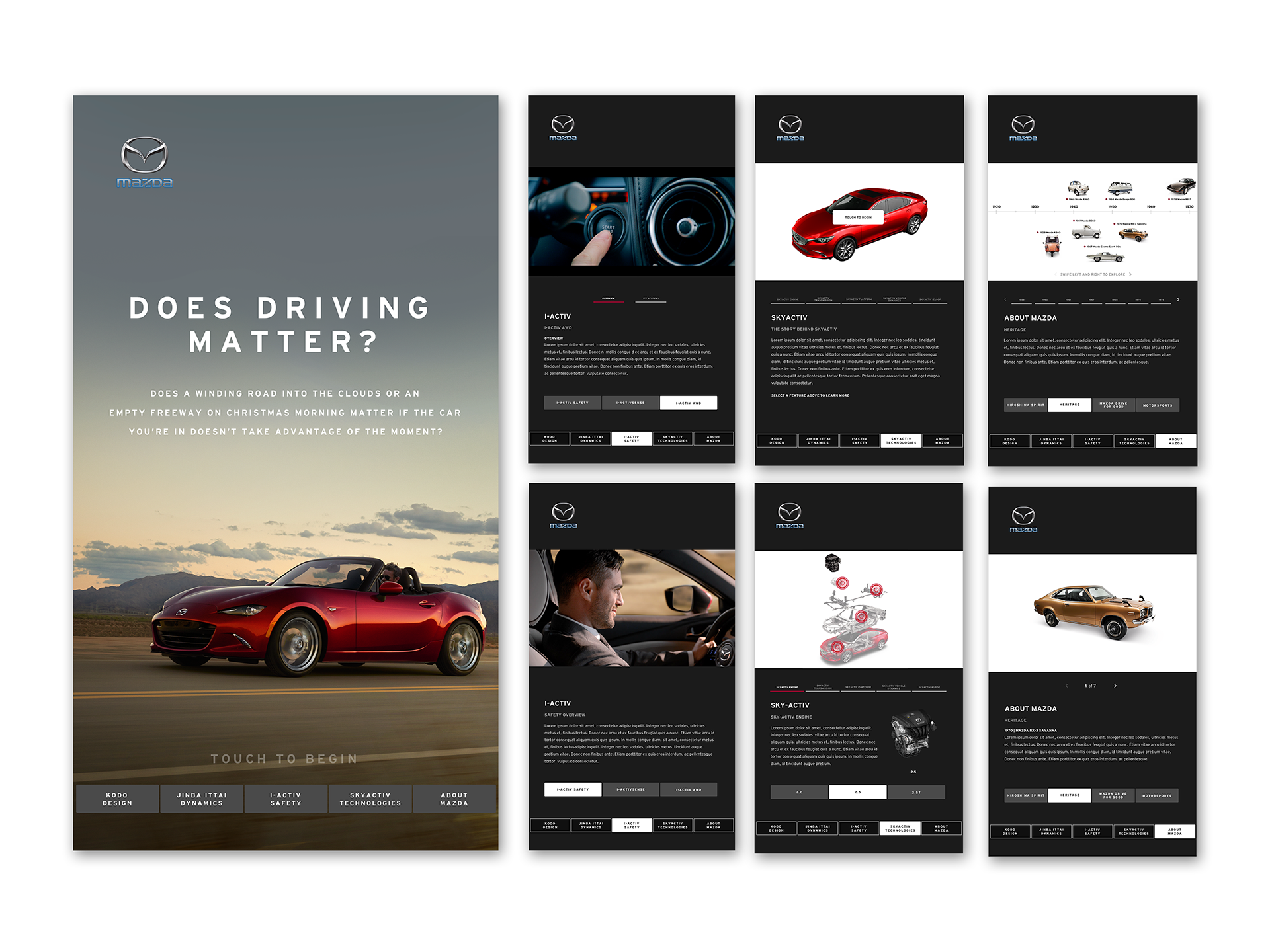
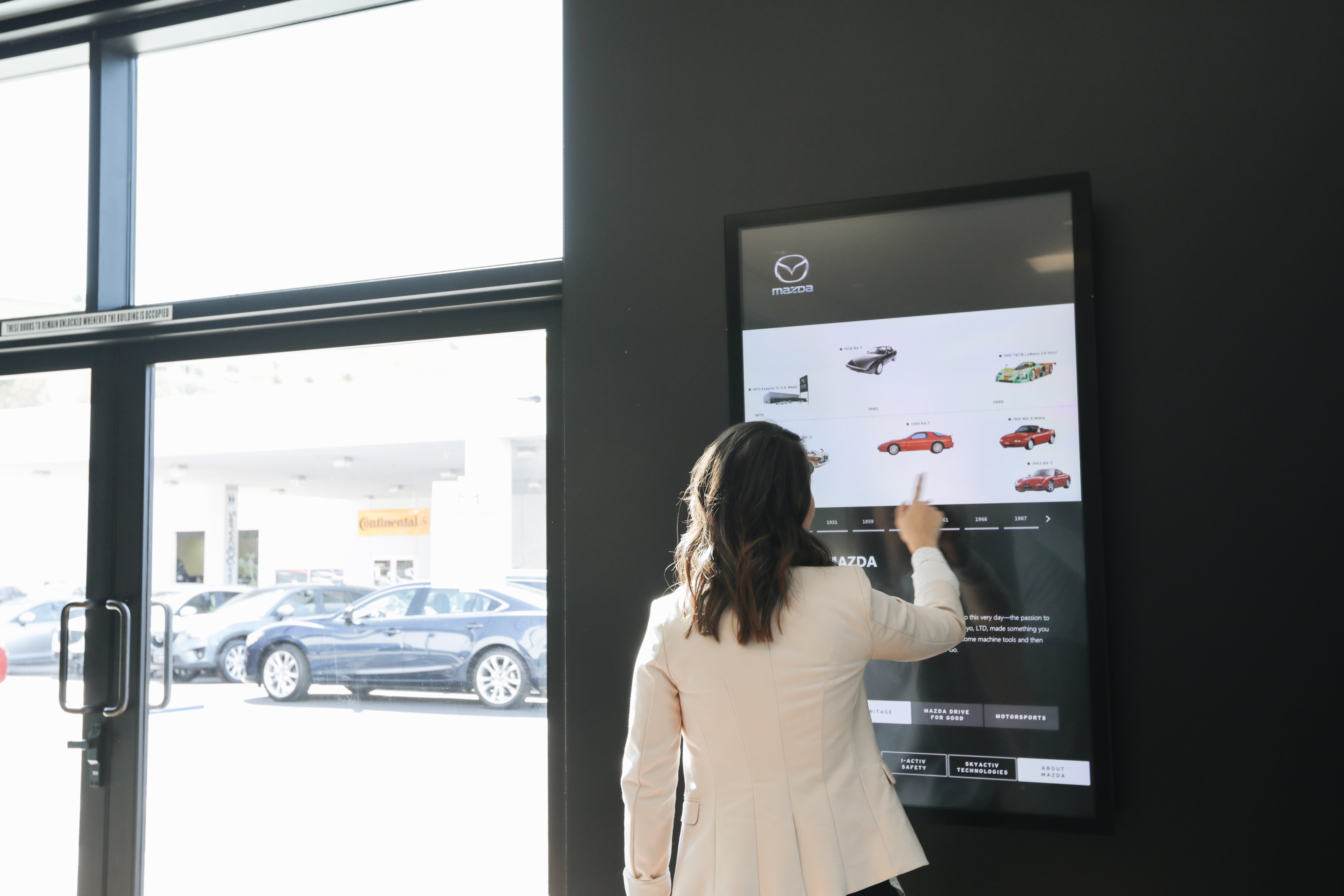
Brand standard, with more to build on
The screens now serve as a brand standard component to all new Mazda dealerships, and will be implemented at existing dealerships over time. Post-implementation observation and interviews confirmed that customers, dealers, and sales representatives all expressed great satisfaction with the interface, and that the original goals set out by MNAO Corporate were achieved.
Post-implementation research also revealed additional improvements that could make the screens even more valuable. Those findings informed recommendations for a 2.0 iteration.
A/B testing and deeper user analytics would sharpen future iterations. The post-launch research confirmed the experience was working, but more granular data on how customers actually moved through the screens would support smarter decisions about where to invest in 2.0.
The UX Studio could have gone deeper, and broader. Bringing in more business groups earlier would have surfaced additional requirements and reduced late-stage scope changes. The discovery was strong, but more stakeholder involvement from the start would have been better.
Design for the physical environment, not just the screen. Designing for a showroom touchscreen is fundamentally different from designing for a desktop or phone. How customers physically approach it, the ambient light, and the real-estate around it all affect how the design reads. That context has to be part of the process from the first wireframe, not a late adjustment.