Simplifying the experience
When a customer signs with Arctic Wolf, a clock starts. Their environment isn't fully protected until deployment is complete, and completing deployment requires gathering a significant volume of technical configuration data like contacts, access controls, site information, network diagrams, cloud services and sensor details. The accuracy and completeness of what customers provide determines how quickly monitoring can begin.
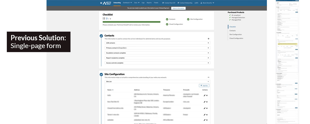
Before this redesign, that process ran through a single-page form. The deployment team would walk customers through it on a call, send them off to fill in what they could, and then reconvene to patch the gaps. The gaps were significant, and they were largely predictable, as customers consistently stumbled on the same categories of questions, because the form gave them no context on what was being asked or where to find the information in their own environment.
Every gap meant another call, which cost deployment team hours and pushed the customer's time-to-value further out. The process was designed around the assumption that customers would need help and the next iteration was designed to change that assumption.
Continuity by design
The project saw a consistent structural challenge in repeated PM turnover, with five different PMs worked this project during my involvement. Each transition meant losing institutional knowledge, including the research that shaped v1, the reasoning behind specific design decisions, the nuance of what customers had said in interviews. In the absence of structural continuity, design continuity became my responsibility.
Five PM Transitions
Each new PM arrived without the context that shaped current design decisions. It became necessary to re-establish that context of why the information architecture was structured the way it was, what research had informed it, which directions had been considered and ruled out. It reinforced the importance of keeping design rationale documented and accessible, not just the designs themselves.
The Complexity Lives in the Customer's Environment
The information customers needed to provide required them to navigate their own technical environment to retrieve it, and that inherent complexity couldn't be designed away. What design could do was give customers the context to understand what they were looking for and why it mattered, so they could find it independently rather than needing to ask.
Leveraging the subject matter experts
I interviewed both sides of the onboarding process. Three customers who had recently completed deployment shared what the experience was actually like from their seat. Six internal deployment specialists provided the depth and pattern recognition that a small customer sample alone couldn't produce, by sharing their perspective having seen the same friction points across hundreds of customer calls.
The deployment team were brought back across multiple rounds as the design evolved, functioning as ongoing consultants who could pressure-test whether a proposed change would actually help in the field. Their proximity to the problem and stake in making it better made them the most reliable signal available.
We mapped the full organizational and environment structure customers were being asked to describe, which helped surface where the definition gaps and lookup complexity were concentrated. We then ran a Good/Better/Best framework to prioritize possible interventions across three dimensions: architecture, format, and features.
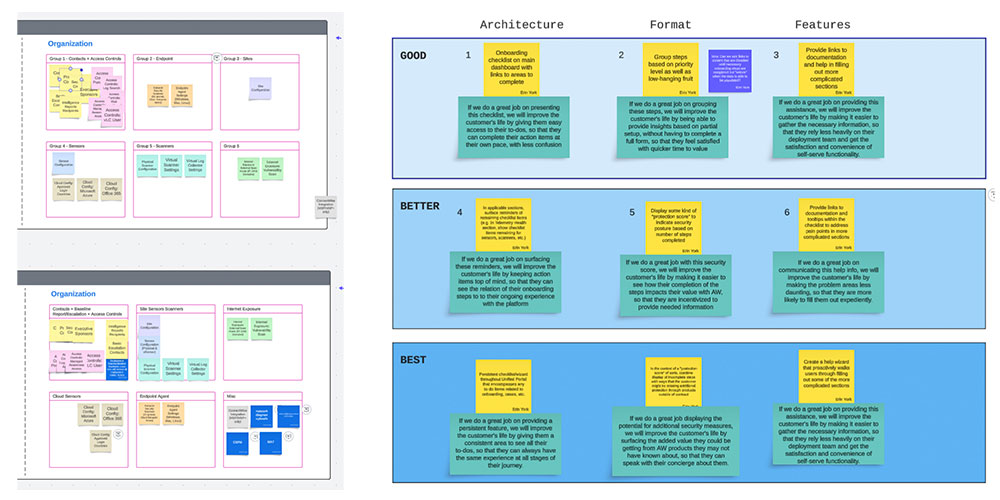
The most consistent finding wasn't about the volume of information customers had to provide, although that can be overwhelming. It was about orientation. More often, they quickly became lost or distracted without a sense of where they stood, what they still needed to complete, and what a finished onboarding looked like. The problem was directional clarity, not capability.
Customers didn't necessarily need less to do. They needed to understand what they were doing and be able to see how far they had to go.
A dashboard built around progress
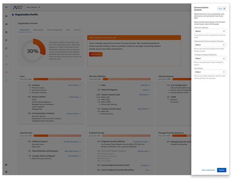
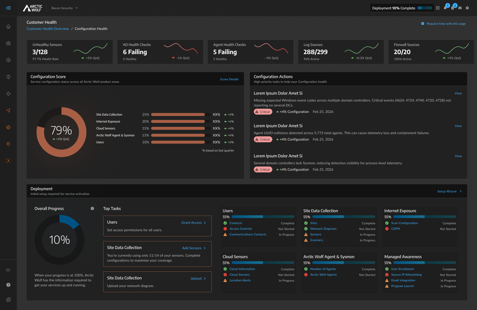
The v1 design replaced the single-page form with a structured dashboard view of the full deployment. Each major configuration area was surfaced as its own section with a clear status, a summary of what was complete and what remained, and direct action links for what came next. Customers could work at their own pace, return when they had more information, and arrive at their next call with their deployment team having made meaningful progress on their own. Moreover, they were immediately introduced to the portal through which they'd manage their security journey long after deployment.
Lead with visual progress indicators
Progress visualization wasn't part of the original brief and wasn't something the deployment team's existing process had ever surfaced. The research made it clear that customers' biggest orientation problem was not knowing where they stood or what "done" looked like, or having any clear incentive to get there. A donut chart with overall deployment completion percentage, paired with section-level progress bars, addressed that directly. By providing clear correlation between their to-do list and their security posture, the incentive became obvious.
Feedback collected from initial users indicated customers were arriving to their follow-up calls with fewer gaps, and they reported feeling motivated to keep moving because they could see what remained. The visualization created a feedback loop that changed behavior, while also informing users through key metrics.
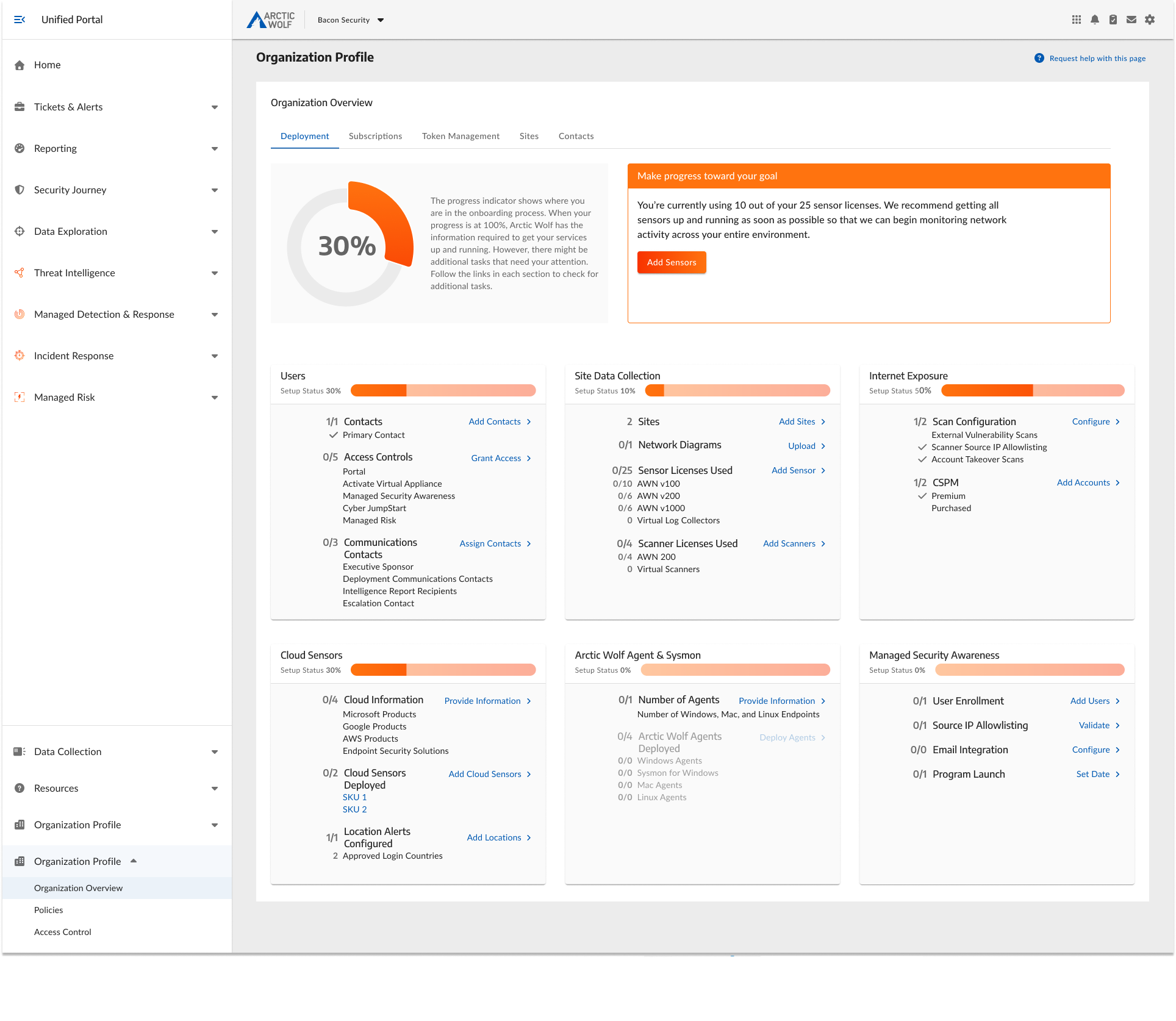
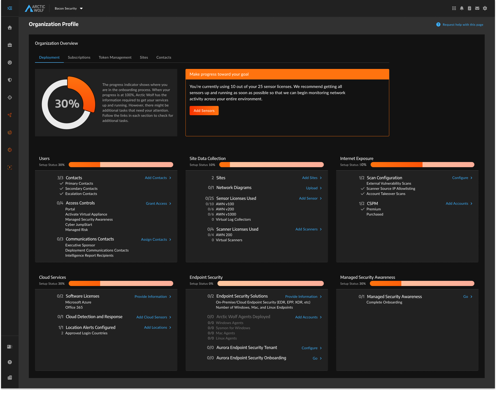
Some sections allow users to expand individual categories to take action directly, without leaving the dashboard. A slide-out drawer allowed them to complete specific forms in context, with the rest of their progress visible behind them.
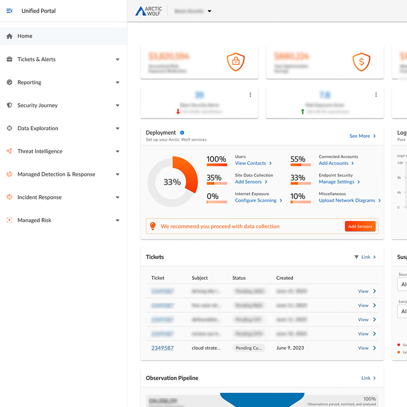
Deployment progress also surfaced on the portal home page as a persistent widget, so customers arriving anywhere in the platform could see where their onboarding stood and navigate directly to what needed attention, without having to find the dashboard first.
User metrics defining continued evolution
User interviews after v1 launched produced generally positive feedback. The progress indicators had landed well, with customers were completing more of their deployment independently before reconvening with the deployment team, and the remaining gaps were smaller and more specific. Fewer gaps before the reconvene call meant shorter calls and less deployment team time spent on follow-up coordination, even without exact hour totals to attach to it. The visual structure had done what research suggested it would.
Two patterns came through in the negatives, and they were consistent enough to take seriously.
Discoverability
Customers weren't always finding the right place to take action. The dashboard surfaced what needed to be done, but the path to doing it wasn't always obvious enough. Users were occasionally getting lost between the dashboard view and the specific sections they needed to complete.
Still Needing Deployment Team Help
Despite the improved structure, some customers were still relying on the deployment team to get through the process. Not because they couldn't find things, but because they still lacked enough context to understand what was being asked and where to find the answers in their own environment. The dashboard had improved orientation, but hadn't fully solved guidance.
These two findings together pointed toward a more guided, sequential experience that walked customers through each section rather than presenting the full scope at once and letting them self-navigate.
V2 Direction
Enhancing the guided experience
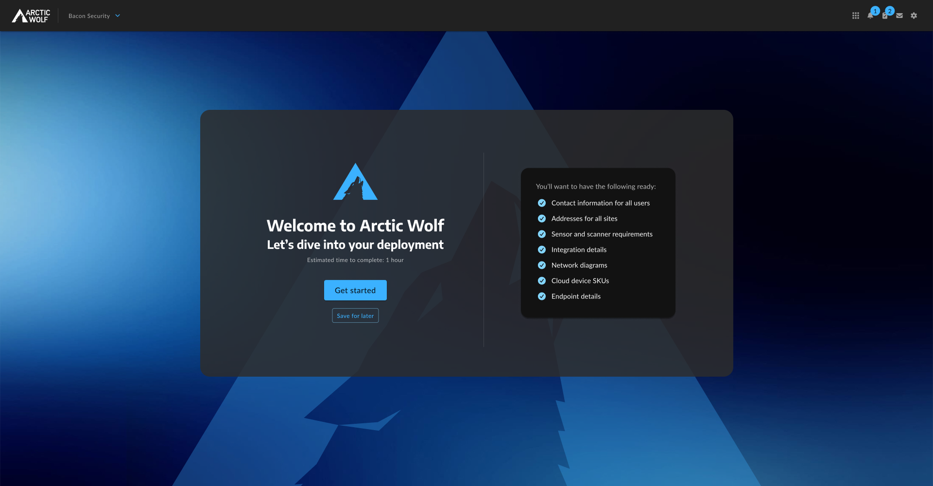
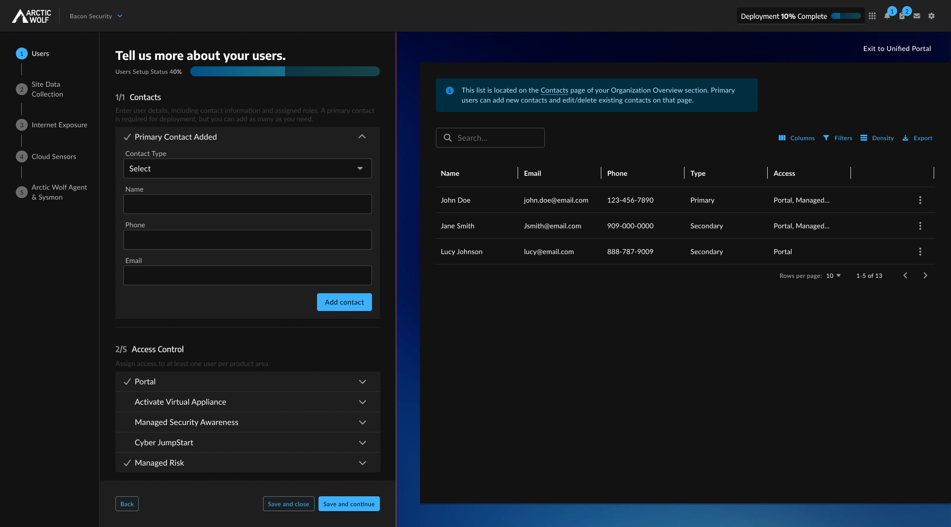
The v2 direction responds directly to what the feedback identified. Instead of presenting the full deployment scope on arrival and letting customers find their own way through it, the new experience opens with a dedicated welcome screen and walks users through each configuration section sequentially, with richer context on what's needed, clearer definitions, and guidance on where to find the required information in their environment.
The welcome screen sets expectations before customers touch a single form field: here's what you'll need, here's what to have ready, here's what the process looks like. That framing alone addresses a significant portion of the confusion the dashboard couldn't prevent.
The wizard itself is a step-by-step experience with a persistent left navigation showing where customers are in the process and what's still ahead. Each step focuses on one configuration area at a time, with the relevant form surface and contextual information presented together. Customers are guided rather than forced to self-navigate, while still being given the option to do so.
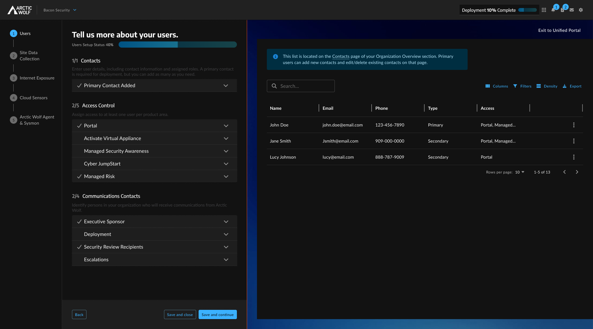
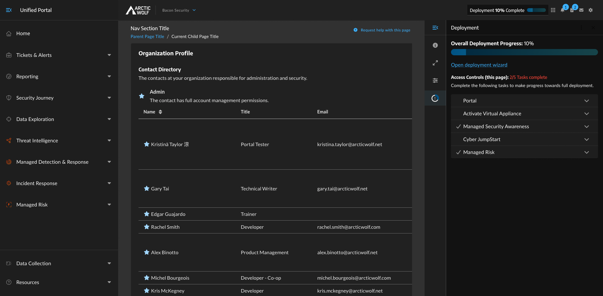
Deployment progress remains accessible throughout the portal via a persistent page panel, so customers can check where they stand or jump back into the wizard from anywhere in the platform without losing their thread.
The v2 work also aligns with a broader strategic initiative at scale. The framework developed here to define visualization dashboards around customer actions items and status is informing how customer health is surfaced across the platform going forward. The principles outlast the specific implementation.
V2 is currently in active iteration and ideation. The direction is defined, but the execution is still being refined as we work to support the greater business goals.
Insights from a deliberately two-phase process
When PMs turn over, the designer becomes the keeper of institutional memory. Five PM changes across the life of this project meant losing context repeatedly. In the absence of structural continuity, I became the most reliable source of it. That's a meaningful responsibility, and it reinforces the importance of careful documentaion of the reasoning behind design decisions matters as much as documenting the decisions themselves. The "why" is what survives a transition.
Progress visualization changed behavior more than any other single element. Adding a completion percentage and section-level status bars wasn't an obvious choice at the start and wasn't in the brief. It came from listening to what customers said they were missing: a sense of where they were and what "done" looked like. Seeing customers complete more of their deployment independently confirmed this decision and the visual indicators are being adopted more widely in other areas of the products. We learned that showing people how far they've come is sometimes more powerful than showing them what they still need to do.
Research participants who live with a problem every day are worth more than single-interview snapshots. The deployment specialists who ran every onboarding call weren't just a convenient substitute for customer access. Brought back across multiple rounds, they gave us a view of the design working in the field, not just how people anticipated it would work. Sustained involvement from someone who sees the problem repeatedly produces better signal than a single touchpoint with someone who experienced it once.